
Not just the flowers. The invitation, the website, the place mat, the signage, the send-off — each one is a picture you can have before you book anybody.
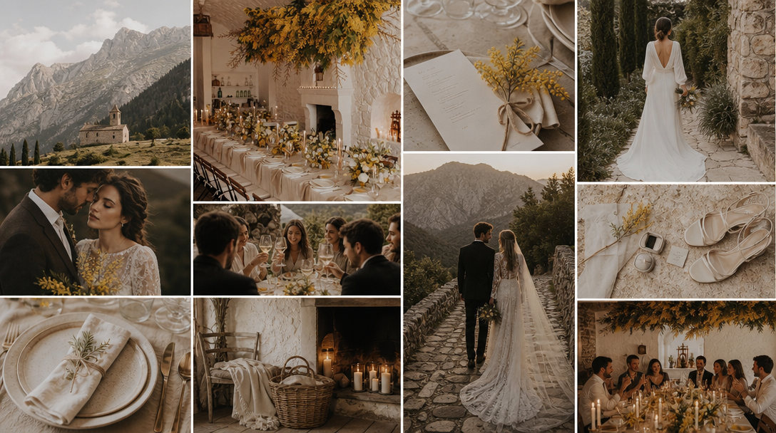
A wedding isn't one look. It's about thirty small design decisions that all have to agree with each other, made across a year, by people who never meet. The calligrapher never sees the linens. The printer never sees the flowers. Whoever builds the website is usually one of you, at eleven at night, picking whichever template looked least bad.
Every one of those people is working from the same sentence somebody typed into an email — warm and romantic, but not rustic — and it means something different to all of them.
That's the thing worth knowing about MoodyBoards for a wedding: you can describe any single piece of the day in a couple of words and get a reference image of it, in your palette, in your style. Not a search result of somebody else's wedding. A picture of yours. Which means the vague sentence becomes a picture you can hand to the person who has to build the thing.
Planners run on this, because a couple who has approved a picture stops relitigating the direction in month seven, after the deposits are down. Show two directions, let them pick one, brief every vendor from it. That's the whole method.
Here are twelve pieces of a wedding worth seeing before you commit to them. Each one has the description I'd actually type. Change the details to yours.
It's the first thing a guest sees and it sets the expectation for everything after. It's also where the expensive decisions hide — paper weight, ink color, typography, whether there's a vellum overlay. Try describing deckled edges and muted olive letterpress to a printer in an email, then try showing them a picture. The quote comes back faster and closer to what you meant.
Almost everyone builds one, and almost everyone builds it from a template chosen at midnight, which is why so many wedding sites share nothing with the invitation the same guests got in the mail. Seeing the site first — the type, the hero, the color of the RSVP button — gives you something to match a template against. Cheapest piece to get right, most often left to chance.
The table stationery is where a wedding either reads as considered or as assembled, and it's a small surface carrying a lot of decisions: the card stock against the linen, the menu's alignment, printed or hand-lettered, whether there's a printed mat under the setting at all. Calligraphers quote by the piece and by the complexity, so a reference image here is worth real money. It's the difference between three rounds of proofs and one.
The most argued-about image in wedding planning, because it's the one guests sit inside for four hours. Seeing it forces the decisions that otherwise get made by whatever the rental company happens to have: table shape, linen drop, candle height, how low the centerpieces sit, whether there are any. It also ends the long-tables-or-rounds conversation in about a minute.
Florists read images fluently and are understandably impatient with adjectives. Romantic but not fussy is four different weddings. What a florist needs is shape, density and palette proportion — how much of the bold color, used where. Do the bouquet and the big installation separately; they're different builds on different budgets, and couples routinely find they care enormously about one and not at all about the other.
Every photograph of the vows has this behind it, which makes it one of the highest-leverage decisions on the list and one of the last anybody thinks about. Arch or no arch, floral or fabric, symmetrical or deliberately not. Generating it at the hour you're actually marrying is a small trick that catches a real problem — namely which direction everyone will be squinting.
Welcome sign, seating chart, bar menu, the little card explaining what the drink is. These get ordered late, usually from a different vendor than the invitations, and they're the most common place a wedding's look quietly comes apart. Describing them in the same breath as the invitation keeps the typography consistent across paper and acrylic and mirror — something guests never consciously notice and always feel.
Not the dress. That gets decided in a shop, in person, and no board is going to help. What a board settles is everything around it: whether the wedding party matches or just shares a palette, the suit color, the second look for the reception. It also answers the question every guest asks and no invitation ever answers properly, which is what garden formal is supposed to mean.
Here's the one nearly everybody misses. Boards get made in daylight, and then most of the wedding happens after sunset under whatever lighting the venue already owns. Deciding the night look on purpose — string lights or uplighting or nothing but candles, how dark the room is actually allowed to get — is the difference between reception photographs that look like your wedding and ones that look like a hotel function.
Bakers work from pictures. That's simply the medium of the trade, and arriving with a paragraph is doing it the hard way for no reason. Texture is the part words fail at — whether the buttercream is combed or swept or deliberately rough, whether the finish is matte, how the flowers sit on it. Do the dessert table separately if you're having one; the arrangement is a different decision and usually a different person's job.
Small budget, disproportionate memory. This is a packaging decision more than a gift decision — the bag, the tag, the tissue, the printed card explaining what's inside. It's also the piece most likely to be handed off entirely, which is exactly why it needs a picture. Whoever assembles a hundred of these at a kitchen table is not going to intuit your typography from a group chat.
The last photograph of the night, and the one most likely to be improvised badly at eleven o'clock. Sparklers, ribbon wands, dried petals, a car, nothing at all. Picturing it is half aesthetic and half logistics — seeing it makes you ask who hands these out, whether the venue allows open flame, and how wide the exit actually is. All better questions to have in month three than in minute six hundred.
Don't do all twelve. Nobody needs twelve boards, and a couple handed twelve will make zero decisions.
Start with the tablescape, the invitation and the after-dark look. Between them they fix the palette, the typography and the light, and every other piece on this list is downstream of those three. Once they're settled the rest come quickly, because you're describing variations on a direction that already exists.
If you're a planner, do it in the first meeting rather than after it. A couple who has picked between two boards while sitting in front of you has made a decision. A couple emailed a PDF has been given homework.
One honest limit, worth saying plainly: these are references, not catalogs. You can't book the venue, order the dress or buy the linens in the picture. What you can do is show the person who will source them exactly what you meant — which is the entire problem.
Most wedding mood boards cover flowers, palette and a venue shot. The pieces that cost money and cause disagreement usually get left off: the invitation suite, the wedding website, the place cards, the signage, the lighting after dark. A board is most useful when it covers the things you will have to brief somebody else to make.
As the approval document. Rather than asking a couple to imagine a direction from a description, a planner shows two visual directions, has one chosen, and briefs every vendor from that single agreed reference. It turns a taste argument into a decision made early, while changing direction is still free.
No. Generated images are references for a direction, not catalog photos. You cannot book the venue, order the dress or buy the linens shown in a generated board. Their job is to show a florist, printer or photographer exactly what you mean, so the real thing they source or make lands where you wanted it.