
A brand mood board is how agencies and brand designers align a client on direction before a single asset goes into production. Build one that shows the direction in use — not just swatches — and approvals come faster.
Every branding project lives or dies on one moment: the client either nods at your direction or doesn't. Skip alignment and you head into production on a guess. Logos, packaging, and social get built against a direction no one actually signed off on — and the revisions, the re-shoots, and the "this isn't what we pictured" emails are all downstream of that. A brand mood board is the cheapest place to have the hard conversation. It puts palette, type, and tone on one board, in front of the client, before the expensive work starts.
The problem is that most brand mood boards still look like a wall of references. Hex codes, a couple of fonts, some pulled imagery. The client says "looks nice" because there's nothing concrete to react to — and then disagrees the moment they see it applied to their actual packaging. The fix is to make the board show the direction working: the same palette, type, and mood carried onto real assets a client recognizes.
The core colors and how they're weighted — primary, support, and accent — so the brand reads consistently across every surface.
Display and body type pairings with the personality they carry: editorial, technical, playful, restrained.
The client's existing mark and any identity cues the new direction has to respect or evolve.
How photography and graphics should look and feel — lighting, framing, texture, subject treatment.
The overall feeling the brand should leave: warm and human, sharp and premium, raw and confident.
A client approves a direction when they can see it applied — logo on the bag, palette on the storefront, type on the menu. Each of these boards does that in one screen.
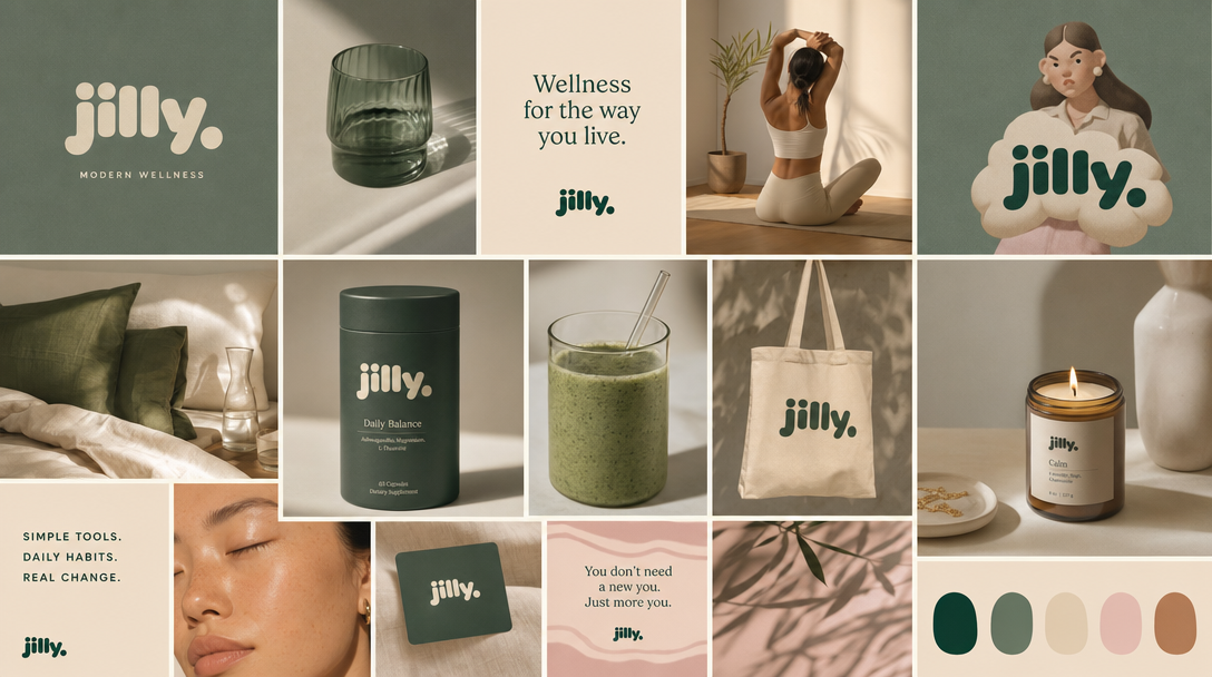
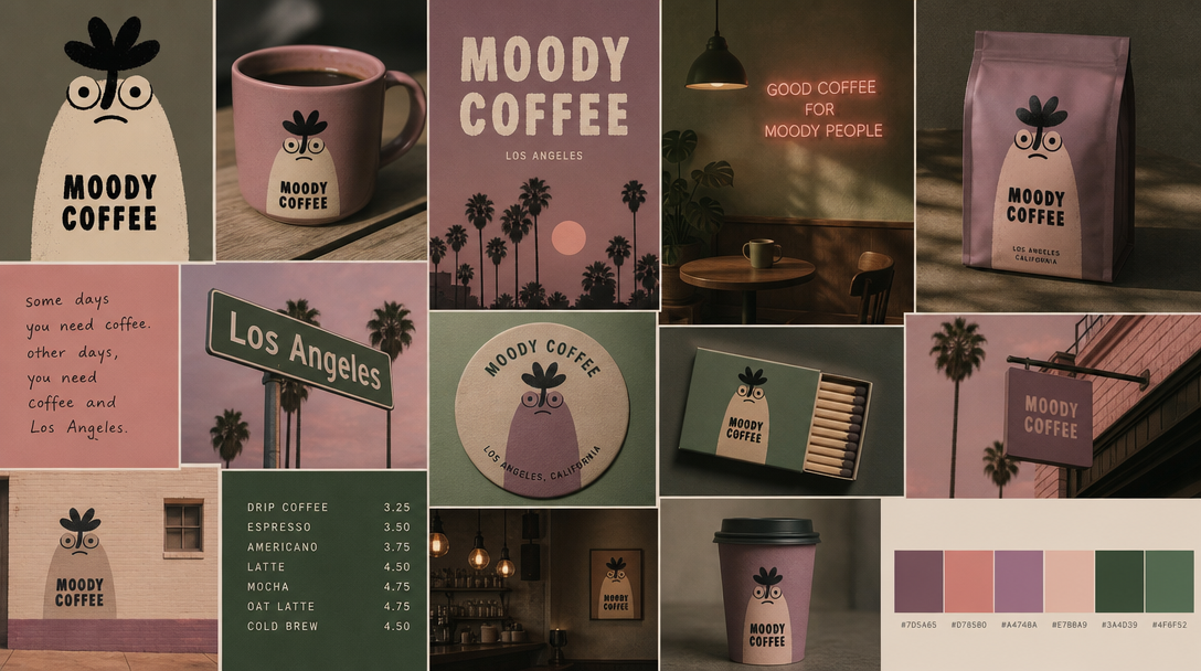
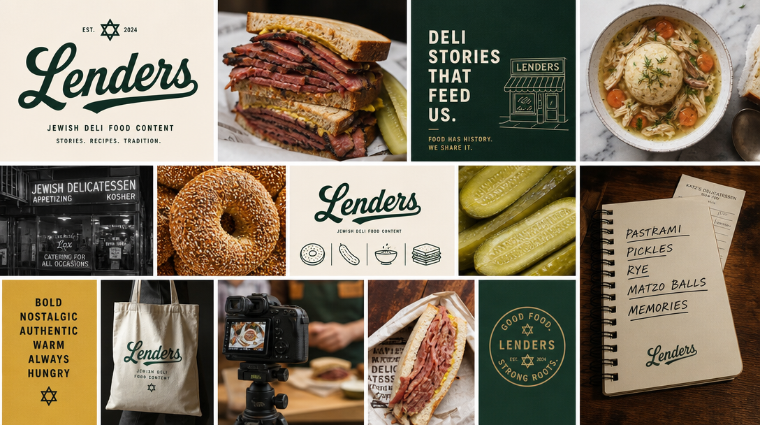
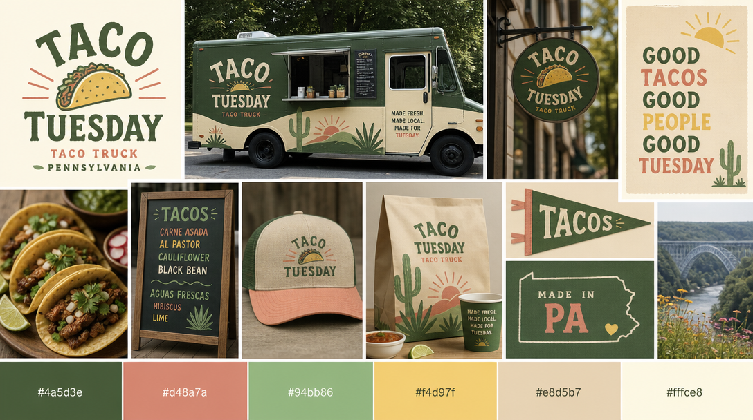
MoodyBoards saves a brand's visual direction once, so everything you generate afterward stays on-brand automatically. Three steps:
Showing the direction applied to real assets beats abstract swatches every time. A client can't picture how a muted palette and a condensed serif will feel on their packaging — but they can react instantly when they see it on the box. The decision gets concrete, and concrete decisions get made.
Consistency across the set does the rest of the work. When the packaging, the social post, and the ad creative all clearly belong to the same brand, the direction reads as a system, not a one-off render. That's what makes a client trust it. And when they want to see a different direction — warmer, more premium, more stripped-back — you change the board and regenerate the whole set fast, instead of rebuilding mockups by hand. Iterating in front of the client, in the room, is often what closes the approval.
A brand mood board is a single board that captures a brand's visual direction — palette, typography, logo and identity references, imagery, and overall mood. Agencies use it to align a client on direction before any production work begins, so everyone is approving the same thing.
Swatches and type samples are abstract. MoodyBoards saves the direction once, then generates on-brand example assets — packaging, social posts, ad creative, storefronts — that all inherit it. Clients see the direction applied to real work, which is far easier to approve than loose references.
Yes. Images you generate are cleared for commercial use with no attribution required, so you can put them straight into client decks and presentations.
MoodyBoards is free to start. Paid plans are Starter at $9.99 per month and Pro at $19.99 per month for designers and agencies who run more brands and present more often.