Thirteen real generated boards and ten copy-ready recipes — brand identity to film worlds — broken down by palette, typography, and lighting. Steal the structure, then build your own.
Most mood boards fail for the same reason: they're a pile of pretty things with no through-line. A strong mood board isn't a scrapbook. It's a repeatable visual direction — a small set of colors, a typographic feel, and a lighting mood that any new image or asset can inherit and still look like it belongs.
The test is simple. If you handed your board to a stranger and asked them to produce one more image for the brand, would they land in the same world? If yes, the board is doing its job. If everything just "looks nice" but pulls in five directions, it isn't a direction — it's a mood.
The mood board examples below each pass that test. Every one names its brief, its palette, its type, and its lighting, plus what you'd actually generate from it. Read them as recipes, not as art to copy.
Everything below was generated from a short written description — no stock hunting, no collage hours. Steal the palette logic, the type pairings, and the way each board commits to one feeling.
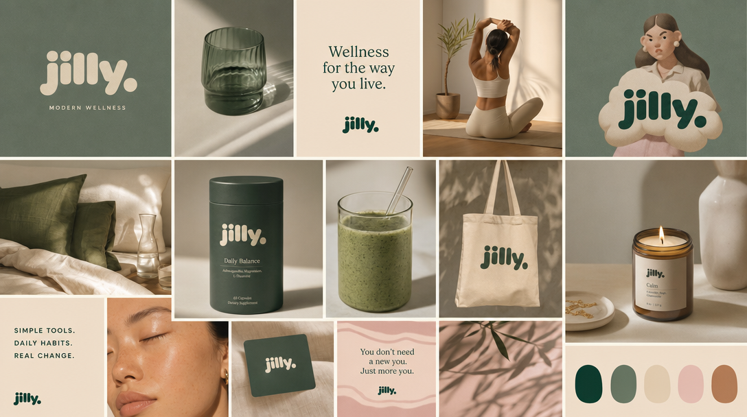
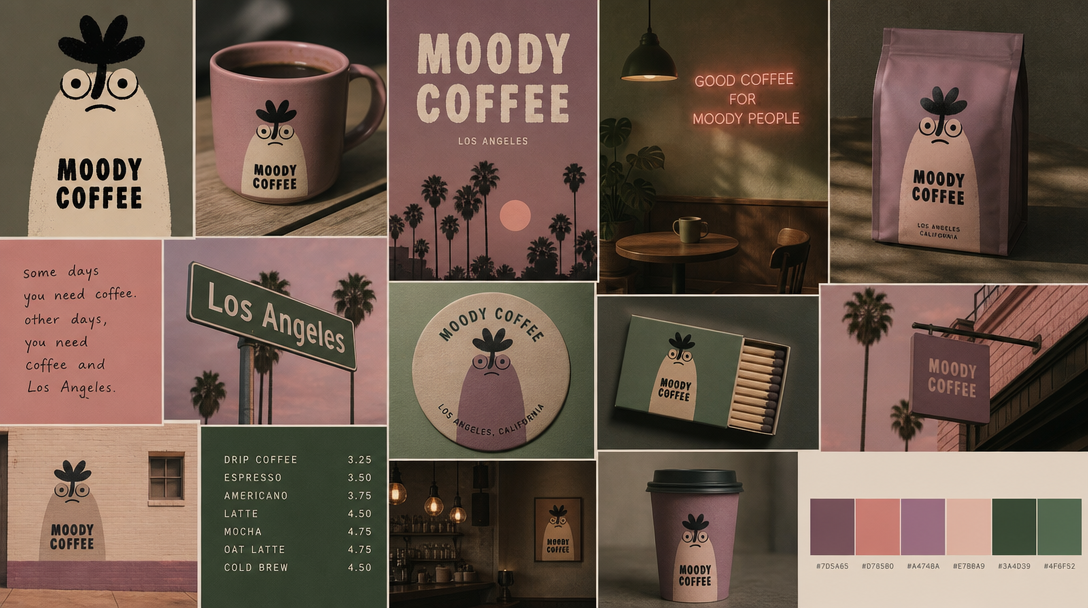
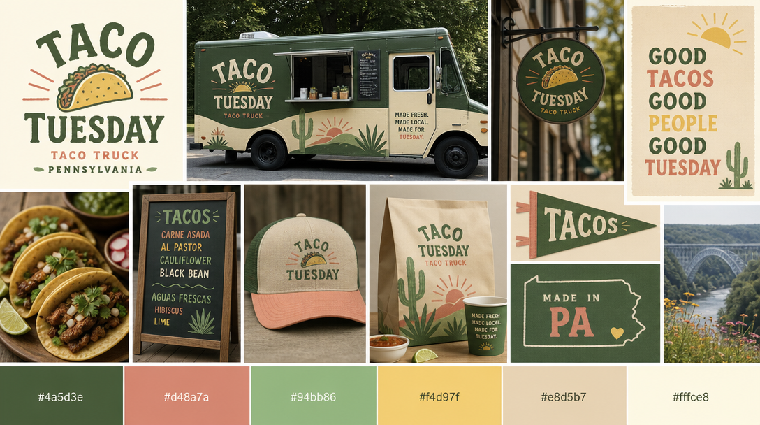
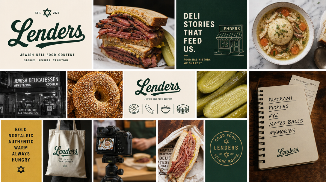
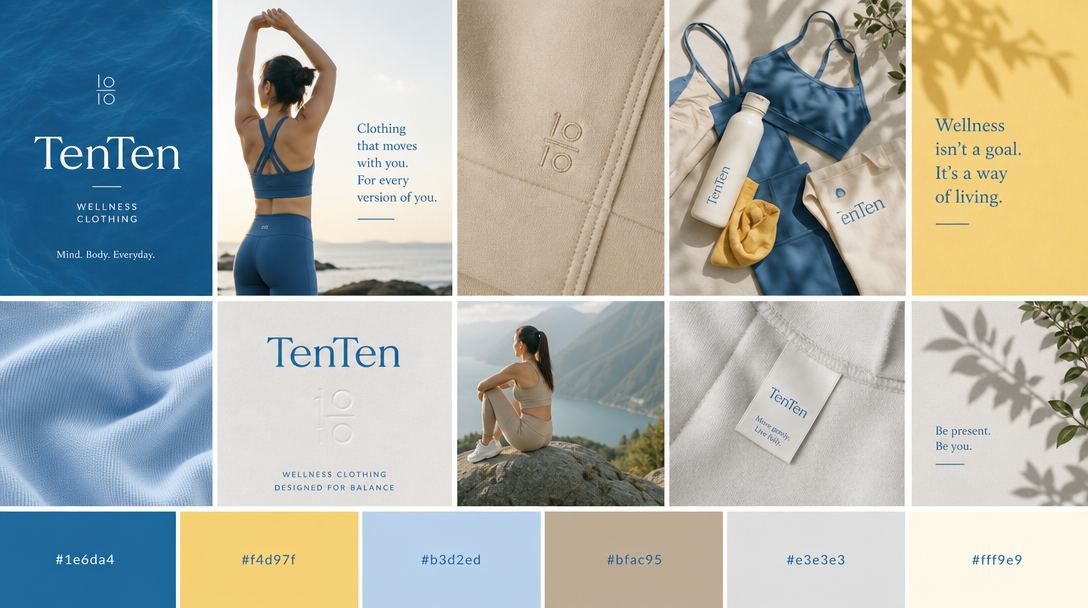
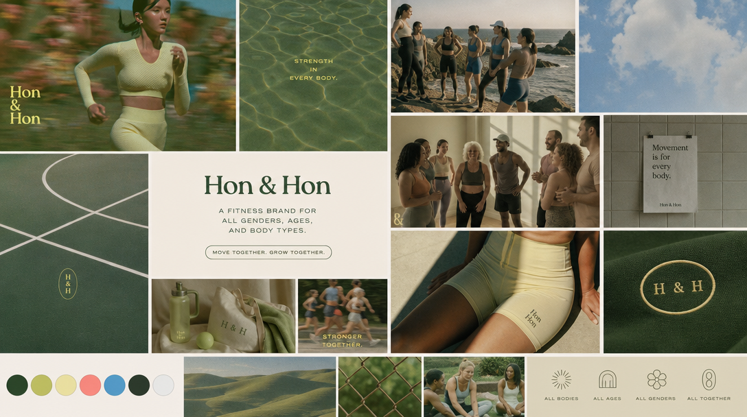
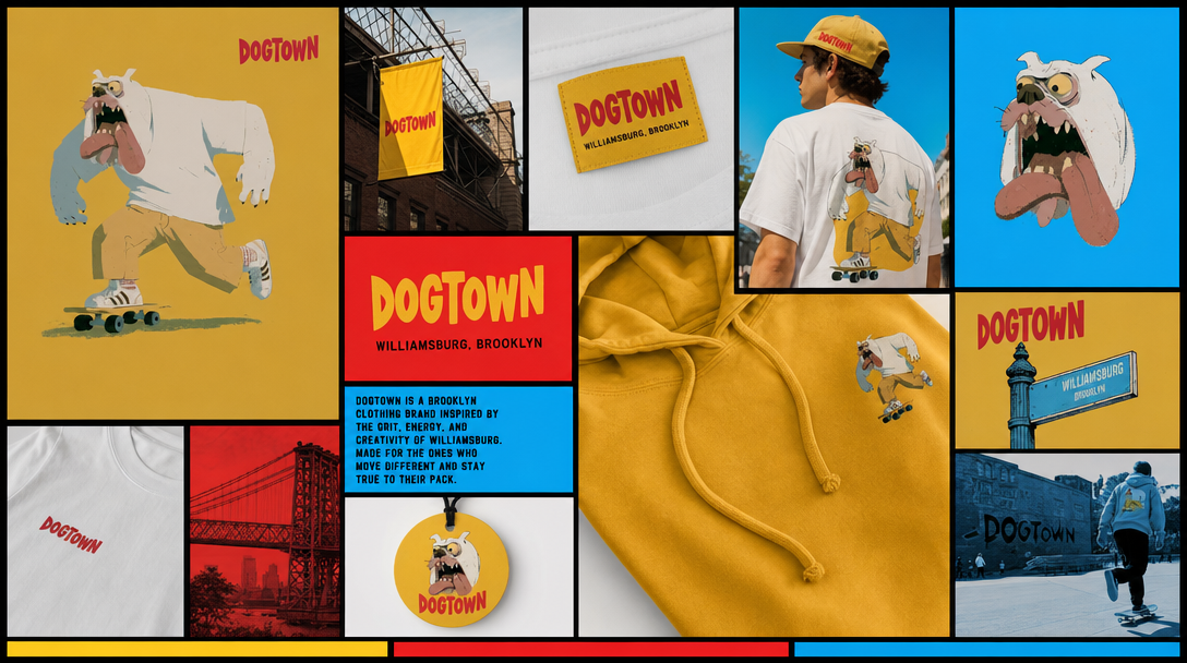
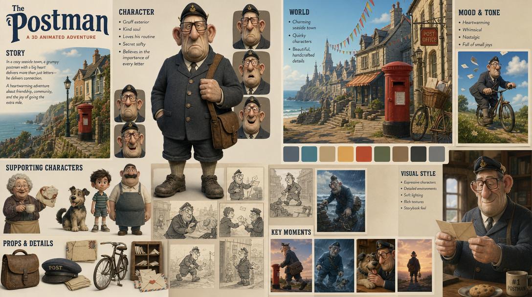
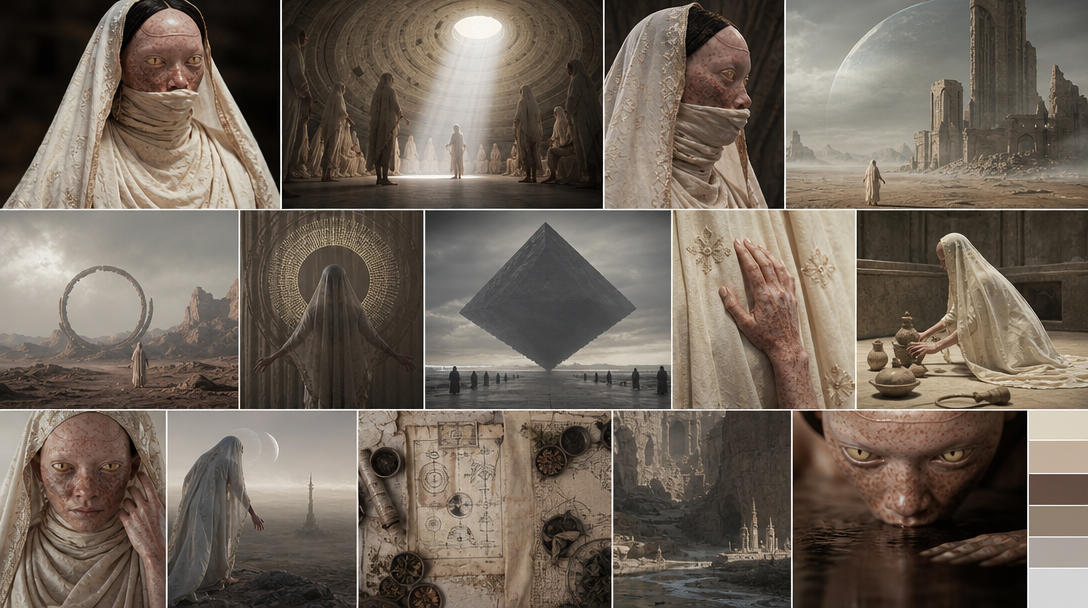
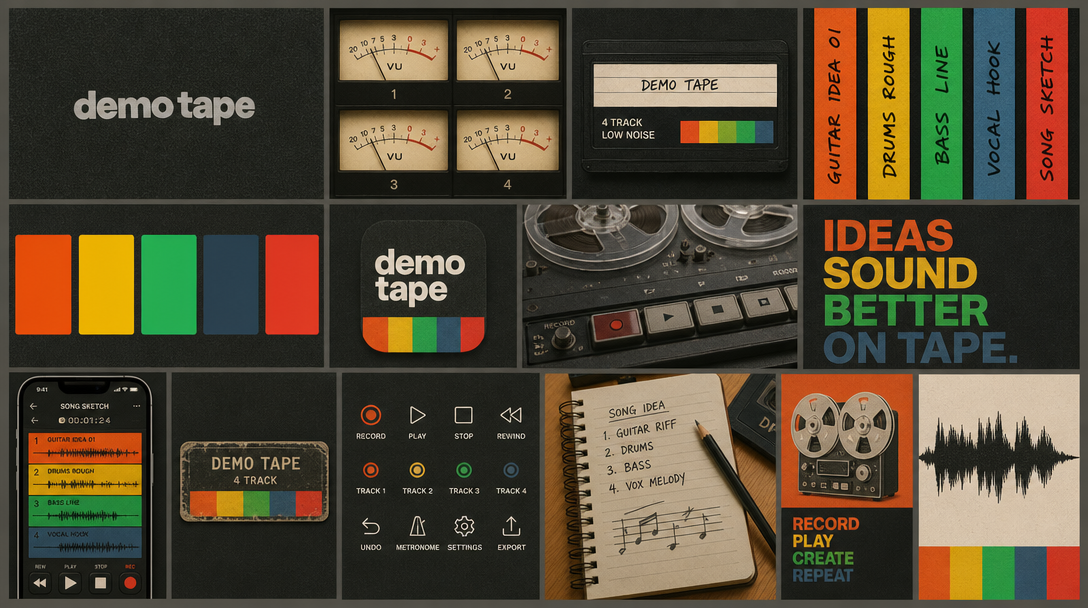
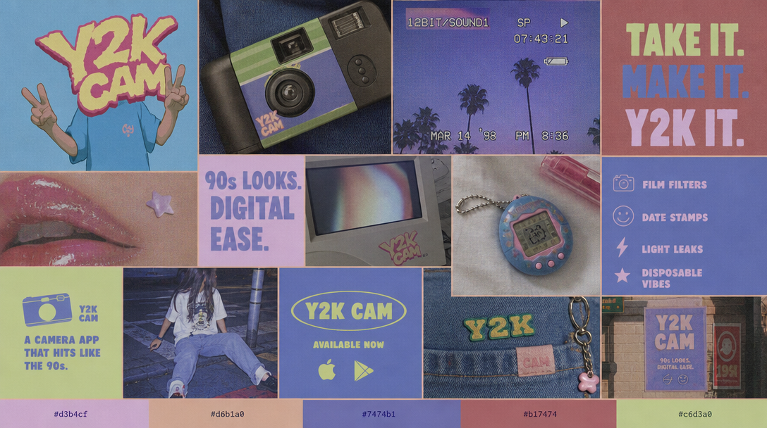
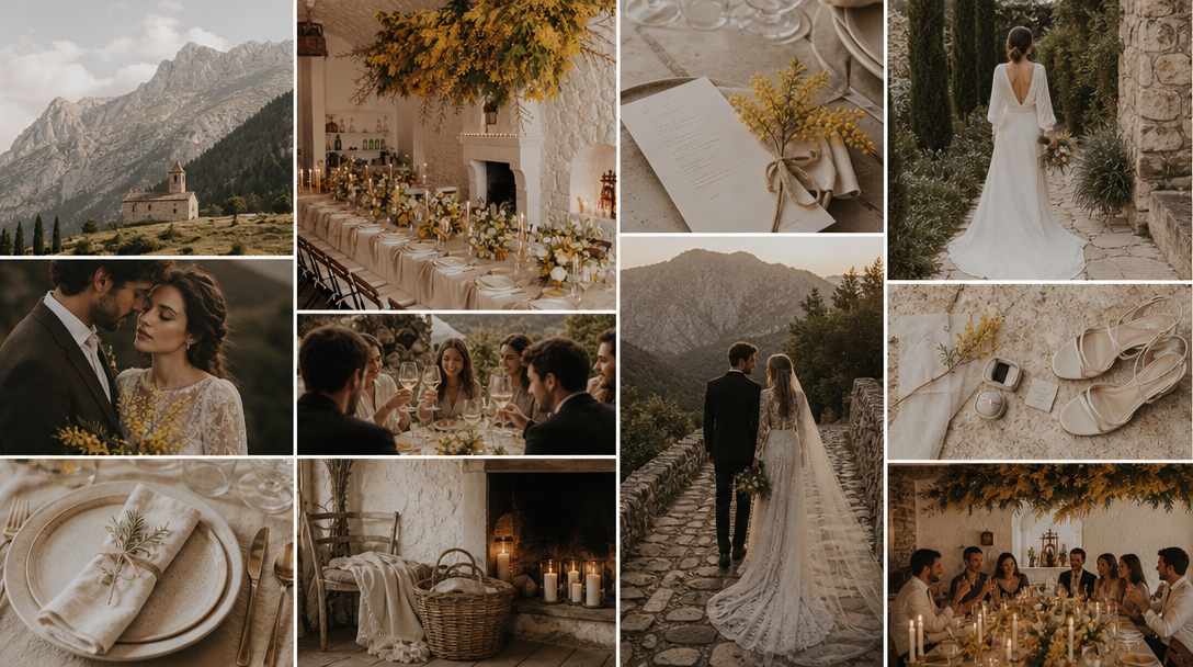
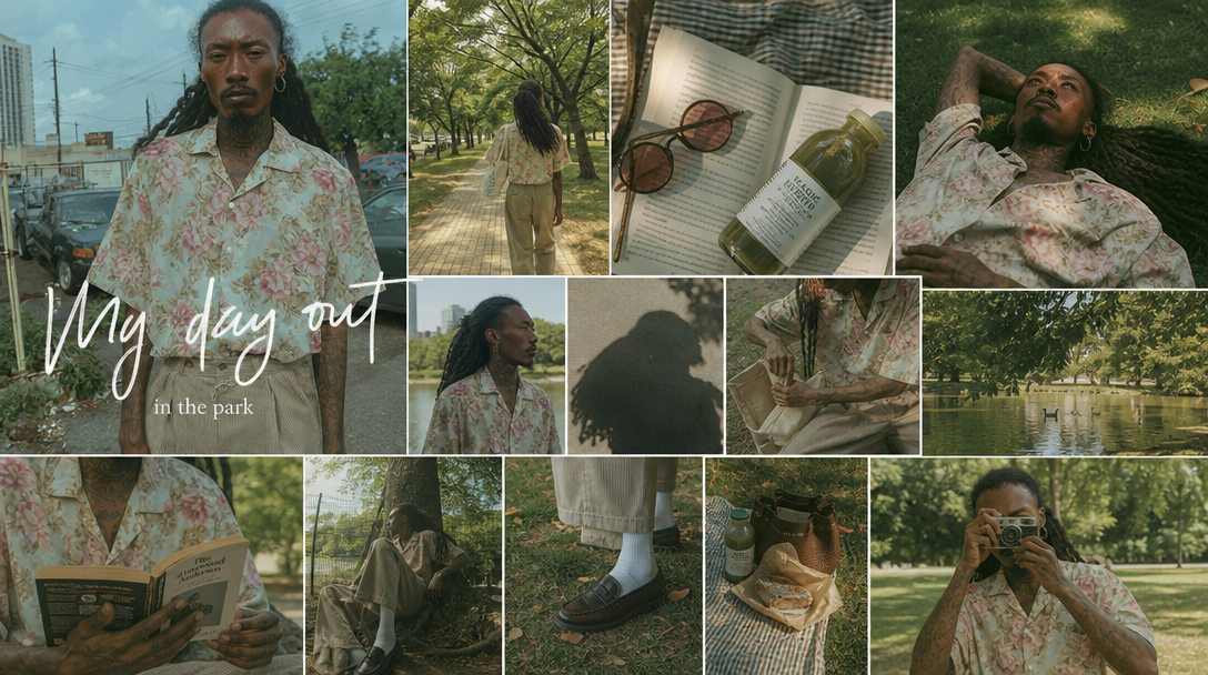
Brief: A clean, science-meets-comfort serum line that feels expensive but never clinical.
Palette: sand, oat, clay, walnut, espresso.
Type: A high-contrast serif for the logo, a soft grotesque sans for body. Lighting: Soft diffused daylight, long gentle shadows, no harsh speculars.
Generate from it: A frosted-glass bottle on a linen surface, a single dewy droplet macro, a hand holding the product in window light.
Brief: A chef's-table tasting room where the food is lit like jewelry and the room disappears into shadow.
Palette: charcoal, cocoa, oxblood, brass, candlelight.
Type: An engraved-feeling serif with tight tracking, all-caps for menu headers. Lighting: Single warm key light, deep falloff, candle glow, everything else in near-black.
Generate from it: A plated course on dark slate, a half-poured glass of red catching the light, the room shot wide with one lit table.
Brief: A loud, nostalgic drop brand — chrome, gloss, and early-2000s internet energy.
Palette: ice blue, hot pink, chrome, ultraviolet, black.
Type: A bubbly chrome display face with bevels, paired with a tech mono. Lighting: Hard flash, blown highlights, lens flare, glossy reflective surfaces.
Generate from it: A puffer jacket shot on chrome, a flip-phone-era flyer collage, a model in front of a CRT glow.
Brief: A breezy seaside home studio — natural fibers, salt air, nothing precious.
Palette: chalk, sea glass, sage, deep teal, driftwood.
Type: A relaxed humanist sans with generous spacing, lowercase headlines. Lighting: Bright overcast daylight, airy and even, faint sun haze.
Generate from it: A linen-draped chair by an open window, woven baskets on bleached wood, a flatlay of shells and ceramics.
Brief: A rain-soaked neon megacity for a sci-fi feature — the poster has to feel like a single frame.
Palette: midnight, cyan, magenta, violet, sodium amber.
Type: A condensed industrial sans, all-caps, with a glitch-mono subtitle. Lighting: Wet streets reflecting neon, hard rim light, volumetric fog, deep shadow.
Generate from it: A lone figure under a neon sign in rain, a skyline of holographic ads, a tight portrait lit by two colored sources.
Brief: A gallery-grade seasonal lookbook — restrained, confident, magazine-spread feel.
Palette: paper white, bone, taupe, ink, one terracotta accent.
Type: A didone display serif for covers, a neutral grotesque for captions. Lighting: Studio softbox, clean gradients, controlled shadow, no color cast.
Generate from it: A full-length studio portrait on seamless paper, a cropped fabric detail, a negative-space cover with a single accent.
Brief: A calm meditation and habit app — grounded, warm, never neon-bright.
Palette: cream, wheat, sage, olive, terracotta.
Type: A rounded geometric sans for warmth, soft-weight headings. Lighting: Golden-hour glow, soft gradients, organic grain, low contrast.
Generate from it: Abstract hill gradients, a ceramic mug in morning light, blurred greenery backgrounds for cards.
Brief: A precision timepiece reveal — engineering as art, every surface intentional.
Palette: onyx, gunmetal, steel, gold, platinum white.
Type: A precise neo-grotesque with tight numerals, thin all-caps subheads. Lighting: Controlled studio reflections, sharp speculars on metal, gradient backdrop.
Generate from it: A macro of the dial and crown, the watch floating on a graphite gradient, a wrist shot in directional light.
Brief: A debut record cover — handmade, nostalgic, a little faded at the edges.
Palette: aged paper, ochre, moss, sepia, faded rust.
Type: A vintage slab serif or hand-lettered title, typewriter credits. Lighting: Film grain, warm fade, soft vignette, slightly lifted blacks.
Generate from it: A grainy portrait in a field, a still-life of worn instruments, an analog-textured cover with hand type.
Brief: A pared-back furniture brand — function-first, light wood, quiet confidence.
Palette: snow, birch, oak, stone grey, charcoal.
Type: A clean geometric sans, lowercase, lots of whitespace. Lighting: Flat Nordic daylight, even and cool, soft natural shadow.
Generate from it: An oak chair against a plaster wall, a styled corner with one plant, a flatlay of joinery details.
You don't have to assemble a board by hand. In MoodyBoards, describe your brand or story in a sentence — "warm minimalist skincare," "rain-soaked cyberpunk thriller" — and you get an original board: a palette, typography, lighting, and overall mood, generated as a single coherent direction. Then generate on-brand images that inherit that direction, so the next asset always matches the first.
Use any of the examples above as a starting prompt, or push it somewhere new. It's built for designers, brands, agencies, fashion designers, and filmmakers, and everything you make is cleared for commercial use with no attribution required. Free to start, with Starter at $9.99/mo and Pro at $19.99/mo when you need more depth.