The board is not decoration. It is the approval document — the thing a client or cofounder says yes to before you spend real money making assets.
By C. Borden· Designer, 20 years · Founder of MoodyBoards · July 2, 2026
Most brand mood boards fail at the same moment: presentation. A grid of pretty images gets a "nice!" and no decision. A board that shows the identity applied — the logo on the bag, the palette on the storefront, the type on the menu — gets a yes or a no. Both are useful. "Nice" is not.
What goes on it
Palette in context. Not five swatches in a row — the colors on packaging, walls, and screens, so everyone sees how they behave.
Typography with a job. The heading face on a sign, the body face on a label. Type samples floating in space decide nothing.
The mark, repeated. Your logo (or a placeholder wordmark) on three or four real surfaces. Repetition is what makes it feel like a brand instead of a design.
One mood, no hedging. If the board has a warm half and a cool half, you have two boards. Split them and present both.
Two boards that got the yes
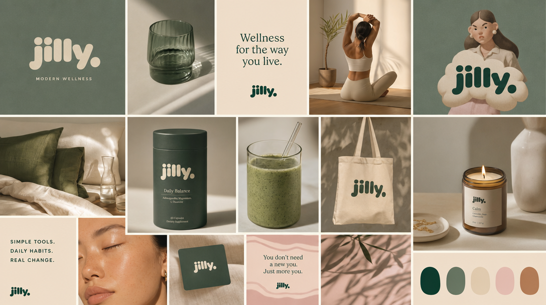
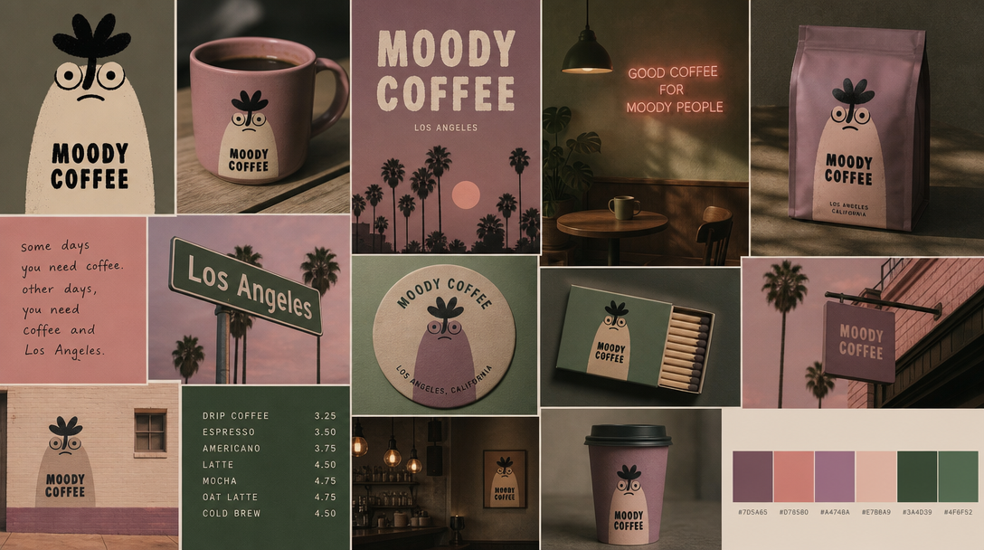
Jilly. The identity lives on supplements, totes, coasters, and candles. A client seeing this is not approving colors — they are approving their company's future shelf presence.Moody Coffee. A risky mascot direction made safe to approve, because the board shows it working on the cup, the sign, the menu, and the matchbox before anyone commits a dollar.
The process
1. Write the brand in one paragraph
Name, what it sells, and the feeling — the way you would describe it to a friend, not a brief. "A neighborhood coffee brand for people who like their mornings quiet and their espresso serious."
Starter description — paste and edit"A neighborhood coffee brand — quiet mornings, serious espresso. Deep green and cream, classic serif, warm low light."
2. Generate, then react
Put the paragraph into MoodyBoards and you get a full board — palette, type direction, and the identity applied to real objects. Reacting to a real board is faster than assembling one: you immediately know what is wrong, which is the fastest route to what is right.
3. Present two directions, not five
Five options produce committee mush. Two clear directions produce a decision. Make the second board deliberately different — warmer, louder, stranger — so the choice means something.
4. Get the yes on the board, then produce
Once the board is approved, it becomes the source of truth. Every social post, package, and page after gets one test: does it fit the board? In MoodyBoards that test is automatic — images generated from the board inherit it.
Common mistakes
Approving vibes, not applications. If the client never saw the palette on a product, the approval will not survive the first real asset.
Too many references to other brands. A board of competitor screenshots approves their identity, not yours.
Treating it as final art. The board sets direction. Let the actual design work refine it without renegotiating the whole feeling.